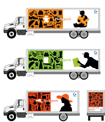
Creative Review has a great post on the new visual identity for Goodwill SF. I like the idea of treating Goodwill as a brand vs. a dumping ground for out-of-date shoes and gently loved toys. This take is fresh enough to work for any modern retail brand, and yet completely in line with their mission.
The sides of the truck emphasize the thrill of the score, finding the perfect whatever in the shop. The back of the truck highlights the donation side. Nice work.
For you locals, the high holy holiday of Halloween is coming, and there is no better place to come up with creative costumes than that downtown SF Goodwill. Shop early, before the best wigs and spandex are gone...
Images from Creative Review. Via NOTCOT.


No comments:
Post a Comment
Here at the lab, we value nice. Gratuitous web links, spam, or general snarkiness will be deleted.